![]()
MineSet provides five visual data mining tools for visual exploration of data and data mining results. The tools utilize animated 3-D landscapes which take advantage of human ability to navigate in 3-dimensional space, recognize patterns, track movement, and make comparisons between objects of different sizes and colors. MineSet's visualizations also allow for a tremendous reduction in the size and complexity of data, condensing potentially millions of records of data into simple, easy to understand, manageable representations.
Although the visualization is key to the exploration process, all of the MineSet visual data mining tools also provide access to the data driving the visualization. Simply click over the components of the visualizations to see the actual data.
MineSet version 1.1 supports the following visual data mining tools:
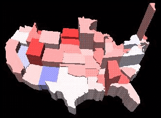
The Map Visualizer supports the analysis of spatially related data and information. By applying data onto height and color of pre-built or user-generated map elements, users have the ability to quickly identify trends, patterns, relationships, and anomalies in data. Deeper insight can be gained through animation, drill-up and drill-down, and animated synchronization of multiple visualizations.
It should also be made clear that this data is not spatial or GIS data. The user applies their own spatial knowledge on top of the data. As an example, the data might contain information for sales of a product for all of the United States. What is not contained in the data is the information which says that there are 50 states in the United States, that California and New York are 3000 miles apart, that California is south of Oregon, or what the latitude or longitude coordinates are for the states. This information is supplied by the user when the map is built. The data can then by mapped onto the United States map, providing a more intuitive view of the data.
The Map Visualizer is a graphical interface that displays data as a three-dimensional "landscape" of arbitrarily specified and positioned "bar chart" shapes. This tool displays quantitative and relational characteristics of your spatially oriented data. Data items are associated with graphical "bar chart" objects in the visual landscape. However, the objects have recognizable spatial shapes and positions, such as those found in geographical maps. The landscape can consist of a collection of these spatially related objects, each with individual heights and colors. You can dynamically navigate through this landscape by:
Up to two numeric variables can be mapped to sliders in the animation control panel. If the variables mapped to sizes and colors of the map entities depend on the variables mapped to sliders, the sliders can be used to drive an animation. As the sliders are moved, changing the value of the independent data, the size and color of the entities representing the dependent data will be animated to show their change. The animation control panel also lets you trace animation paths in one or two dimensions. You can then play back the path you created and watch the animation for trends or anomalies.
The animation control panel also shows a user defined summary of the data, defined by selecting form a set of pre-defined aggregations, such as summation or average. This visual summary window lets the user identify overall trends and points of interest from a very high level, serving as a pointer to data of interest.


The map landscape can also consist of a flat plane of these spatially-related objects drawn as simple outlines, with "bar chart" cylinders placed at specific point locations or as lines with endpoints at specific point locations, all with individual widths and colors.

Many times, data sets are just too complex for representation in two or even tree dimensions. The MineSet Scatter Visualizer is ideal for analyzing the behavior of data in many dimensions all at once. The Scatter Visualizer is an animated 3-D scatter plot, which also uses size and color of plot entities to represent data dimensions.
With animation, the user has the ability to discover trends, patterns, and anomalies in 7 dimensions, allowing the user to discover data segmentations, clustering and information profiles. Full support is also provided for visual filtering and querying.
The Scatter Visualizer lets you visualize your data by mapping each record, or row, in the dataset to an entity in the three-dimensional scatter plot. Variables in the data can be mapped to the sizes, colors, and the XYZ coordinate positions of the entities.
Up to two numeric variables can be mapped to sliders in the animation control panel. If the variables mapped to sizes, colors, or positions of the entities depend on the variables mapped to sliders, the sliders can be used to drive an animation. As the sliders are moved, changing the value of the independent data, the size, color, and positions of the entities representing the dependent data will be animated to show their change. The animation control panel also lets you trace animation paths in one or two dimensions. You can then play back the path you created and watch the size, color, and motion of the entities for trends or anomalies.
The animation control panel also shows a user defined summary of the data, defined by selecting form a set of pre-defined aggregations, such as summation or average. This visual summary window lets the user identify overall trends and points of interest from a very high level, serving as a pointer to data of interest.
In the three-dimensional landscape, you can orient the display to emphasize particular dimensions or a point of view. The Scatter Visualizer lets you scale the values of variables to give them greater emphasis. Also, you can filter the display to show only those entities meeting certain criteria.
Scatter Visualizer can also serve as an invaluable tool for the discovery of dirty data, sometimes recognized as anomalies through unexplainable behavior.
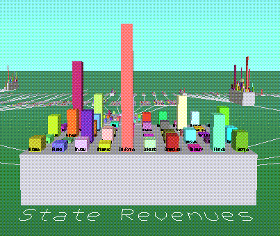
The Tree Visualizer provides the capability to visualize trees and hierarchical data structures. Using a 3-D fly-through navigational paradigm, users can move through data to discover trends, patterns, and anomalies. Users easily explore data graphically with any level of detail or summary, from a bird's eye perspective down to low levels of detail.
The Tree Visualizer is a graphical interface that displays data as a three-dimensional "landscape." It presents your data as clustered, hierarchical blocks (nodes) and bars through which you can dynamically navigate, viewing part, or all, of the data set. The Tree Visualizer displays quantitative and relational characteristics of your data by showing them as hierarchically connected nodes. Each node contains bars whose height and color correspond to aggregations of data values. The lines connecting nodes show the relationship of one set of data to its subsets. Values in subgroups can be summed and displayed automatically in the next higher level. The base under the bars can provide information about the aggregate value of all the bars.
The Tree Visualizer takes data at the lowest level of the hierarchy as input. Data is then aggregated up through the visualization automatically, as defined by the user.
Full support is also provided for visual filtering,querying, and marking.
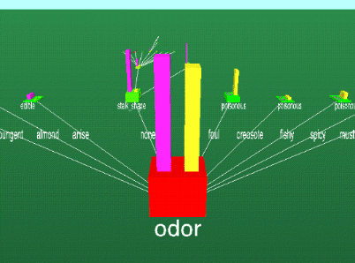
The Tree Visualizer is also used for the display of the decision trees resulting from the Decision Tree Inducer. The Tree Visualizer shows decision and leaf classification nodes. Information about classification distribution and classification purity is shown at each node. The Tree Visualizer allows for further understanding and analysis of the decision trees.
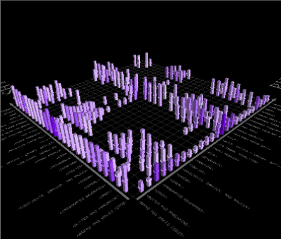
The Rule Visualizer graphically displays results from the Association Rule Generator. By analyzing rules discovered using the Association Rule Generator, users gain greater insight into the nature of a particular data set. The Rule Visualizer quickly reveals the quantity and relative strengths of relationships between elements, helping to focus attention on important data entities and rules.
The rules are presented on a grid landscape, with left-hand side (LHS) items on one axis, and right-hand side (RHS) items on the other. Attributes of a rule are displayed at the junction of its LHS and RHS item. Attributes are displayed using bars, disks, and labels. The 3-D rule grid can be zoomed, rotated, and panned. Visual filtering and querying allows for users to focus in on selected rules.
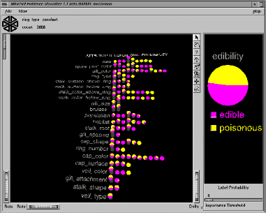
The Evidence Visualizer displays the structure and properties of an evidence classifier built by the Evidence Inducer. The Evidence Visualizer shows how unique values or value ranges of attributes can lead to a particular classification.
Rows of 3-D pie charts or bars represent the attributes used by the classifier. Each pie chart represents the probability or evidence that an attributes value or value range lends to a classification. The height of the pie charts shows the distribution of records have various attribute values. By clicking on the pie charts, the probabilities are combined to give an overall classification probability based upon the known attribute values for data records which are to be classified. Prediction, or "what-if", scenarions can also be done with the Evidence Visualizer.
The Evidence Visualizer also shows what attribute values are strong indicators of evidence for or against a particular classification.
The Evidence Visualizer can be zoomed, panned, and rotated.
Copyright©
1996, Silicon Graphics, Inc. All Rights Reserved.
Trademark Information
Please send your comments to
webmaster@www.sgi.com.