![[Lucent Technologies]](lucentvsr.gif)
| ![[Visual Insights(tm) Logo]](vi_logo.sm.gif)
Data Visualization Solutions |
![[Lucent Technologies]](lucentvsr.gif)
| ![[Visual Insights(tm) Logo]](vi_logo.sm.gif)
Data Visualization Solutions |

Our systems are based on the following guiding principles:
![[Visual Insights(tm) Code Age]](brochure.frame.figure.id.1.gif)
The Visual Insights Code Viewer visualizes code by mapping each line of code into a thin row, colored according to a statistic of interest such as the age, programmer, or functionality of each line. For example, red rows may be the newest lines and blue the oldest lines with a color spectrum in between.
FIGURE 1. Visual Insights Code Viewer
showing code age: the newest code is in red and the oldest is in blue
with a color spectrum in between.
The displayed data is derived from a variety of sources, such as version control systems, static analysis, and profiling. By means of direct manipulation and high interaction graphics, the user manipulates this reduced representation of the code in order to find interesting patterns. Further insight is obtained by using additional windows to display the actual code. Potential applications for the code viewer include data discovery, project management, code tuning, and analysis of development methodologies.
FIGURE 2. Visual Insights Code Viewer
showing program profiling results. Red indicates hot spots, gray nonexecuted lines, and black nonexecutable lines.
![[Visual Insights(tm) Difference Viewer Screen]](seediff_f.thumb.gif)
The Visual Insights Difference Viewer is an interactive system that has two ways of viewing differences. It includes a file browser for viewing the differences between two files, and a directory browser for viewing the differences between directories and their files. Colors are used in both views to denote difference categories: Same (light grey), Added (green), Deleted (red), and Changed (yellow).
FIGURE 3. Visual Insights Difference Viewer
viewing two files. The file browser contains two text areas and
a scrollbar in the center that summarizes the difference of the entire
two files.
FIGURE 4. Visual Insights Difference Viewer can be
applied to entire directories and their files, in addition to just two files
at a time. The directory/file view, shown here, summarizes the results of
diff with several views. The top view show a birds-eye view of the
directory structure (but not files), with each node in the directory
filled with a bar chart showing the total amount of change in that
directory.
![[Visual Insights(tm) Log Viewer Screen]](brochure.frame.figure.id.4.gif)
FIGURE 5. Visual Insights Log Viewer
showing a computer accounting log. Each mark represents one command run on the computer.
![[Visual Insights(tm) Database Viewer Screen]](brochure.frame.figure.id.3.gif)
The Visual Insights Database Viewer
is a visualization system for showing the structure of large relational
databases. It has been implemented to display associations between
relations (tables), mappings between the database and application code,
physical representations of relations, schema information, and paths
through a specific database using multiple linked views.
FIGURE 6. Visual Insights Database Viewer
shows an overview of the tables in the specific database. Each bar represents
one relation with the length and color encoding number of attributes and
access method for the relation.
FIGURE 7. Visual Insights Database Viewer
provides multiple linked views for examining different aspects of the database.
This figure shows views of the access paths through the database,
associations between relations based on queries, and the text of database
queries being simultaneously displayed.
![[Visual Insights(tm) Abstract Network Closeup]](brochure.frame.figure.id.6.gif)
Visual Insights Abstract Network Viewer
displays arbitrary data as a network of interconnected nodes, with the placement of the nodes based on their interactions. Examples we have visualized include international toll fraud, communities of interest in a local telephone exchange, and affinity purchasing relationships for retail sales.
FIGURE 8. Visual Insights Abstract Network Viewer visualization of local exchange phone calls. Node placement displays calling pattern, node color defines the amount of time spent talking; link color codes the direction and length of individual conversations.
FIGURE 9. Visual Insights Abstract Network Viewer visualization of affinities in grocery purchases. Items that were purchased together are linked together, with the color of the linkage indicating the frequency that they occurred together.
![[Visual Insights(tm) View of Congestion]](brochure.frame.figure.id.7.gif)
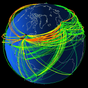
Visual Insights Geographical
Network Viewer visualizes networks that have a layout based
on geography, such as the long distance telephone network. It uses the
underlying geography to position nodes, and provides techniques to allow
the user to filter the data to make patterns visible.
Data may also be animated to show events in time.
FIGURE 10. Visual Insights Geographical
Network Viewer display of the long distance telephone network showing
congestion following the 1987 San Francisco earthquake, showing
congestion at individual switches.
FIGURE 11. Visual Insights Geographical
Network Viewer showing the same data based on network connections between
switches.

|
Copyright © 1997 Lucent
Technologies. All rights reserved.